Fix CountryCard / CountryCardList styling, positioning, responsiveness #59
Description
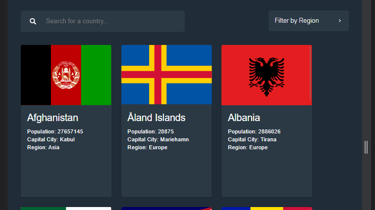
Currently the CountryCard component is looking great, but there are a few issues with the CSS. What we want to fix include:
- finalise country card stylings, such as size and font size (incl. on smaller screen sizes)
- have bigger gaps between cards (and narrower cards)
- make cards stack nicely as screen size reduces, but keeping it positioned centrally
- on smaller screens, have a single card around 80-90% width of the page
- ensure all items (cards and filter bar) have consistent margins
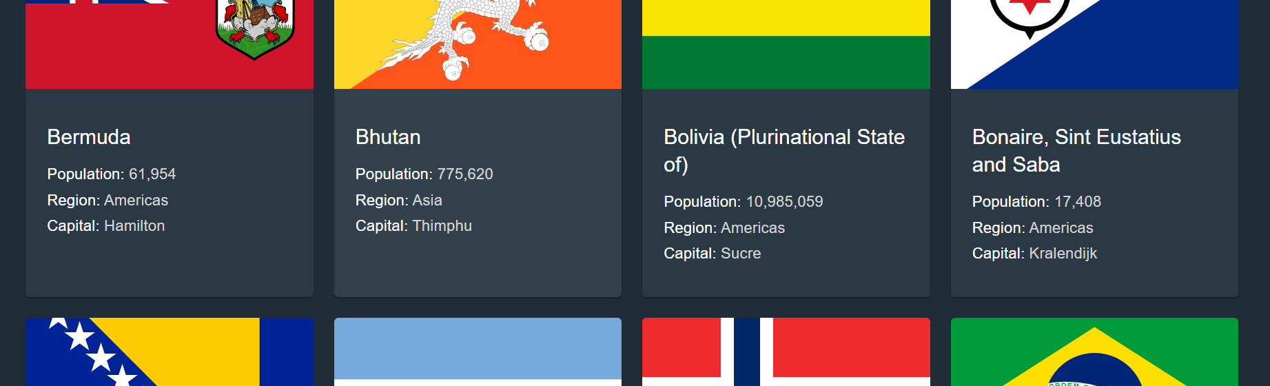
Another issue (shown in second image) is when countries have longer names that go onto a second line, it means card text is no longer aligned between 1-line and 2-line country names