<template>
<div id="select-multiple" ref="select" class="select-multiple">
<a-popover trigger="hover">
<template #content>
<div class="selected-text">
<div class="label" style="margin-right: 4px">已选择:</div>
<div v-for="(i, index) in selectedKey" :key="index" class="box">{{ i }}</div>
</div>
</template>
<a-select
:getPopupContainer="getPopupContainer"
:maxTagCount="maxTagCount"
:maxTagTextLength="2"
:options="options"
:placeholder="placeholder"
:showArrow="false"
:value="selectValue"
mode="multiple"
show-search
style="width: 100%"
@change="changeValue"
>
<template #option="{ value: val, label, icon }">
<div class="select-checkbox"></div>
<div class="value">{{ val }}</div>
</template>
<template #menuItemSelectedIcon>
<div class="select-checkbox-checked"></div>
</template>
<template #dropdownRender="{ menuNode: menu }">
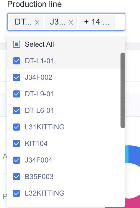
<div class="select-all" @click="selectAll" @mousedown="(e) => e.preventDefault()">
<div v-if="isSelectAllCheckBox" class="select-all-checkbox"></div>
<div v-else class="select-checkbox"></div>
Select All
</div>
<v-nodes :vnodes="menu" />
</template>
</a-select>
</a-popover>
</div>
</template>
<script lang="ts">
import { computed, defineComponent, ref, watch } from 'vue'
export default defineComponent({
props: {
value: {
type: Array,
default: () => [],
},
options: {
type: Array,
default: () => [],
},
maxTagCount: {
type: Number,
default: 2,
},
placeholder: {
type: String,
},
disabled: {
type: Boolean,
default: false,
},
selectDisabledKeys: {
type: Array,
default: () => [],
},
},
components: {
VNodes: (_, { attrs }) => {
return attrs.vnodes
},
},
emits: ['update:value', 'validateFields'],
setup(props, ctx) {
const select = ref()
const selectValue = ref()
const isSelectAllCheckBox = ref(false)
const selectedKey = computed(() => {
const arr: string[] = []
props.options.map((item: any) => {
if (selectValue.value.includes(item.value)) {
arr.push(item.label)
}
})
return arr
})
watch(
() => props.value,
(newVal) => {
selectValue.value = newVal
},
{ immediate: true }
)
watch(
() => props.selectDisabledKeys,
(selectDisabledKeys) => {
if (selectDisabledKeys.length === props.options.length - 1) {
selectValue.value = props.options.map((item) => item.value)
props.options.map((option: any) => {
if (selectDisabledKeys.indexOf(option.value) > -1) {
option['disabled'] = true
}
})
} else {
props.options.map((option: any) => {
option['disabled'] = false
})
}
},
{ immediate: true, deep: true }
)
const changeValue = (value: []) => {
ctx.emit('update:value', [...value])
}
function getPopupContainer() {
return select.value
}
function selectAll() {
if (selectValue.value.length === props.options?.length) {
ctx.emit('update:value', [])
} else {
ctx.emit('update:value', [...props.options?.map((item) => item.value)])
}
//触发表单验证
ctx.emit('validateFields')
}
watch(
() => selectValue.value,
(v) => {
if (v.length === props.options?.length) {
isSelectAllCheckBox.value = true
} else {
isSelectAllCheckBox.value = false
}
},
{ immediate: true }
)
return { selectValue, changeValue, getPopupContainer, selectedKey, select, selectAll, isSelectAllCheckBox }
},
})
</script>
<style lang="scss" scoped>
.select-multiple {
:deep(.ant-select-dropdown) {
padding: 5px 0;
.ant-select-item {
position: relative;
padding: 0;
.ant-select-item-option-content {
font-size: 12px;
line-height: 1;
display: flex;
align-items: center;
padding: 8px 10px;
.value {
flex: 1;
overflow: hidden;
color: #616a88;
}
}
.ant-select-item-option-state {
position: absolute;
left: 10px;
top: 50%;
transform: translateY(-50%);
.select-checkbox-checked {
position: relative;
border: 1px solid #4078e8;
background: #4078e8;
width: 12px;
height: 12px;
border-radius: 2px;
&:before {
position: absolute;
top: 1px;
left: 1px;
display: inline-block;
content: '';
border: 1px solid white;
border-top: none;
border-right: none;
width: 8px;
height: 5px;
transform: rotate(-45deg);
}
}
}
}
}
}
.selected-text {
font-size: 12px;
max-width: 200px;
display: flex;
flex-wrap: wrap;
align-items: center;
.box {
height: 24px;
margin: 2px;
padding: 2px;
background: #f5f5f5;
border: 1px solid #f0f0f0;
border-radius: 3px;
cursor: default;
white-space: nowrap;
}
}
.select-checkbox {
border: 1px solid #d7dae1;
width: 12px;
height: 12px;
border-radius: 2px;
margin-right: 8px;
}
.select-all {
position: relative;
display: flex;
align-items: center;
font-size: 12px;
line-height: 1;
padding: 8px 10px;
cursor: pointer;
&-checkbox {
position: relative;
border: 1px solid #4078e8;
width: 12px;
height: 12px;
border-radius: 2px;
margin-right: 8px;
&:before {
position: absolute;
top: 50%;
left: 50%;
transform: translateY(-50%) translateX(-50%);
display: inline-block;
content: '';
border: 1px solid #4078e8;
background: #4078e8;
width: 6px;
height: 6px;
border-radius: 1px;
}
}
&:active {
background: #f7f8fc;
}
&:hover {
background: #f5f5f5;
}
}
</style>