Welcome to the Openbridge Web Components! This readme file provides an overview of the project and its components.
We are currently developing the code in a joint industry project, with funding from industry partners. The code is only available for the partners until the release in March 2026. It is possible to get access to the code in active development by joining the project.
👉 Click here to read more about the project.
👉 Demo using the implmented components.
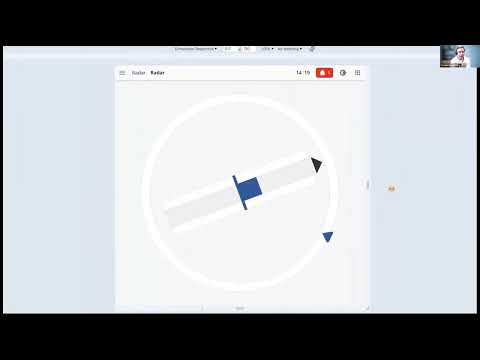
👉 Currently implemented components.
❗Caution❗ This repository is currently in early development and may not be stable. Please use with caution.
Join our discord server to get the latest updates and to ask questions. Join here.
We have made an short introduction to the library. You can watch it here
- Storybook
- Demo
- CSS file for palettes
- Components
- Installation
- Getting Started Developing
- Contributing
Storybook is a development environment for UI components. It allows you to browse a component library, view the different states of each component, and interactively develop and test components in isolation.
The demo showcases the project's functionality using Vue.js. It provides a live demonstration of the project's features and allows you to interact with the application.
The CSS file for the palettes is located at packages/openbridge-webcomponents/src/palettes/variables.css.
The file is called variables.css and contains all the openbridge pallets (bright, day, dusk, night).
It can be used to set the color theme of components.
To select the pallet, set the data-obc-theme attribute on the html tag:
<html lang="en" data-obc-theme="day"></html>The components for this project are implemented in the package/openbridge-webcomponents folder.
To use the components in your project, you can install the package from npm:
npm install @oicl/openbridge-webcomponentsTo use the components in your Vue.js project, you can install the package from npm:
npm install @oicl/openbridge-webcomponents-vue-
Add the css file to your project:
import "@oicl/openbridge-webcomponents/src/palettes/variables.css";
-
Select the pallet by setting the
data-obc-themeattribute on thehtmltag:<html lang="en" data-obc-theme="day"></html>
-
Select the global component size by setting the class (it could be
regular,medium,largeorxl):<body class="obc-component-size-regular"></body>
When the upgrade to OpenBridge 6.0 the size of each component can be modified individually by setting the class on each component. It can also be used to set the size of all components in a container.
-
Install the Noto Sans font by using the attached
NotoSans.tfffile. Add the following to your css:@font-face { font-family: "Noto Sans"; src: url("path/to/NotoSans.tff"); } * { font-family: Noto Sans; }
-
Import the desired components in your project, for instance:
import "@oicl/openbridge-webcomponents/dist/components/top-bar/top-bar.js";
or with vue wrapper:
import ObcTopBar from "@oicl/openbridge-webcomponents-vue/components/top-bar/ObcTopBar.vue";
-
Use the components in your project:
<obc-top-bar></obc-top-bar>
or with vue wrapper:
<ObcTopBar></ObcTopBar>
❗Warning❗ As the code is currently developed in a closed repo we will not accept any PR before the code is published.
To get started with the project, follow these steps:
- Clone the repository.
- Install visual studio code
- Install Docker (requires license for large organizations)
- Open visual studio code
- Open the command palette (Ctrl+Shift+P)
- Run the command
Dev Container: Open Workspace in ContainerSelect theopenbridge-webcomponents.code-workspacefile in the root folder of the repository. This will open the project in a containerized environment with all the necessary dependencies installed. - Optional: Go to the
package/openbridge-webcomponentsfolder and runyarn storbookto start the Storybook development environment. - Optional: Go to the
package/vue-demofolder and runyarn devto run the Vue.js demo application.
- Clone the repository.
- Install Node.js (version 20) and Yarn.
- Run
yarn installin the root folder to install the dependencies. - Run
yarn run build:libto build all libraries. - Optional: Go to the
package/openbridge-webcomponentsfolder and runyarn storbookto start the Storybook development environment. - Optional: Go to the
package/vue-demofolder and runyarn devto run the Vue.js demo application.
This mono-repo contains the following packages:
openbridge-webcomponents: The main package containing the web components.openbridge-webcomponents-vue: A wrapper for the web components to be used in Vue.js projects. It is autogenerated from theopenbridge-webcomponentspackage.vue-demo: A demo application showcasing the web components in a Vue.js project.
Run yarn format:all to format the code using Prettier.
We use snapshot testing of the components through storybook. To run the test:
- Ensure that storybook is running. If it is not running, go to the
package/openbridge-webcomponentsfolder and runyarn storybookto start storybook. - Run
yarn test-storybookin thepackage/openbridge-webcomponentsfolder to run the tests.
Use the yarn test-storybook --watch command to watch for changes and re-run the tests.
Use the yarn test-storybook -u command to update the snapshots.
❗Warning❗ As the code is currently developed in a closed repo we will not accept any PR before the code is published.
See the CONTRIBUTING.md file for details on how to contribute to this project.