A simple and flexible React component for creating fully customizable buttons with optional text overlays. Build buttons your way with complete styling control.
- 🎨 Full Customization — Style buttons and text exactly as you need them
- 🧩 Framework Agnostic — Works seamlessly with Tailwind CSS, styled-components, or plain CSS
- ⚡ Lightweight — Minimal dependencies, maximum performance
- 📝 Flexible Text — Add primary and secondary text labels
- ♻️ Modern React — Built for React 19
- 🎯 Zero Default Styles — You have complete control over appearance
- 📘 TypeScript Support — Full type safety with React.ButtonHTMLAttributes
Install the package using your preferred package manager:
npm install react-button-makeryarn add react-button-makerStep 1: Import the component
import { ButtonMaker } from "react-button-maker";Step 2: Add to your component
<ButtonMaker
  label="Click Me"
  text="Secondary"
  buttonStyle="bg-blue-600 text-white px-4 py-2 rounded"
  textStyle="text-gray-200 text-sm"
  onClick={() => console.log("Clicked")}
/>| Prop | Type | Required | Description |
|---|---|---|---|
label |
string |
✓ | Main button text displayed inside the button |
text |
string |
— | Optional secondary text rendered inline with the button |
buttonStyle |
string |
— | CSS classes or inline styles for the button element |
textStyle |
string |
— | CSS classes or inline styles for the optional text element |
onClick |
() => void |
— | Callback function triggered on button click |
disabled |
boolean |
— | Disable the button (standard HTML attribute) |
type |
"button" | "submit" | "reset" |
— | Button type (standard HTML attribute) |
...rest |
React.ButtonHTMLAttributes |
— | All standard HTML button attributes supported |
Create a polished button with Tailwind utilities:
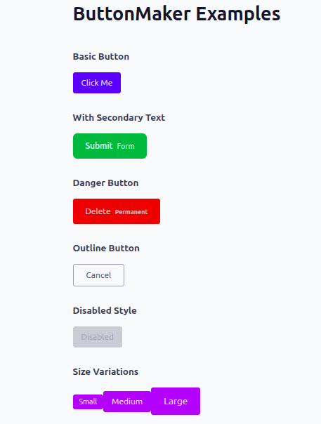
<ButtonMaker
  label="Submit"
  text="Now"
  buttonStyle="bg-green-600 text-white px-6 py-3 rounded-lg hover:bg-green-700 transition-colors"
  textStyle="text-yellow-200 ml-2 text-sm"
  onClick={() => alert("Form submitted!")}
/>Define custom styles in your stylesheet:
<ButtonMaker
  label="Save"
  text="Changes"
  buttonStyle="custom-btn"
  textStyle="secondary-label"
  onClick={handleSave}
/>
styles.css:
.custom-btn {
  background-color: #333;
  color: #ffffff;
  padding: 10px 16px;
  border-radius: 6px;
  border: none;
  cursor: pointer;
  font-weight: 500;
  transition: background-color 0.2s ease;
}

.custom-btn:hover {
  background-color: #555;
}

.secondary-label {
  font-size: 12px;
  color: #999;
  margin-left: 8px;
  opacity: 0.9;
}Full type safety in your React/TypeScript project:
import ButtonMaker from "react-button-maker";

function App() {
  const handleClick = () => {
    console.log("Button clicked!");
  };

  return (
    <ButtonMaker
      label="Click Me"
      buttonStyle="bg-blue-600 text-white px-4 py-2 rounded hover:bg-blue-700"
      onClick={handleClick}
      disabled={false}
      type="button"
      aria-label="Submit button"
    />
  );
}

export default App;
Use any standard button HTML attributes:
<ButtonMaker
  label="Delete"
  text="Permanent"
  buttonStyle="bg-red-600 text-white px-6 py-3 rounded"
  onClick={handleDelete}
  disabled={isLoading}
  type="button"
  aria-label="Delete item permanently"
  data-testid="delete-button"
  title="This action cannot be undone"
/>Clone and install the repository:
git clone https://github.com/Q-Niranjan/react-button-maker
cd react-button-maker
npm install
Build the package for distribution:
npm run buildMIT License © 2025
You're free to use this package in personal and commercial projects. See the LICENSE file for details.
We welcome contributions! Feel free to submit issues or pull requests to help improve react-button-maker.