https://a3-yasmine-aoua.glitch.me
This application is a chore logging application that allows a user to select the chore they completed and enter the number of hours they took to complete it. I faced a variety of
challenges when making this application. The first problem I ran into was getting the authentication working and learning the CSS framework I chose. I just used a basic authentication
method of creating a unique username and a password in my database and checking that when a user enters login information that it matches an entry in the table. I chose this because I
did not have the time to try to figure out a more complex, secure method such as OAuth. I used the Fomatic-UI CSS framework becuase its description says it makes beautiful websites
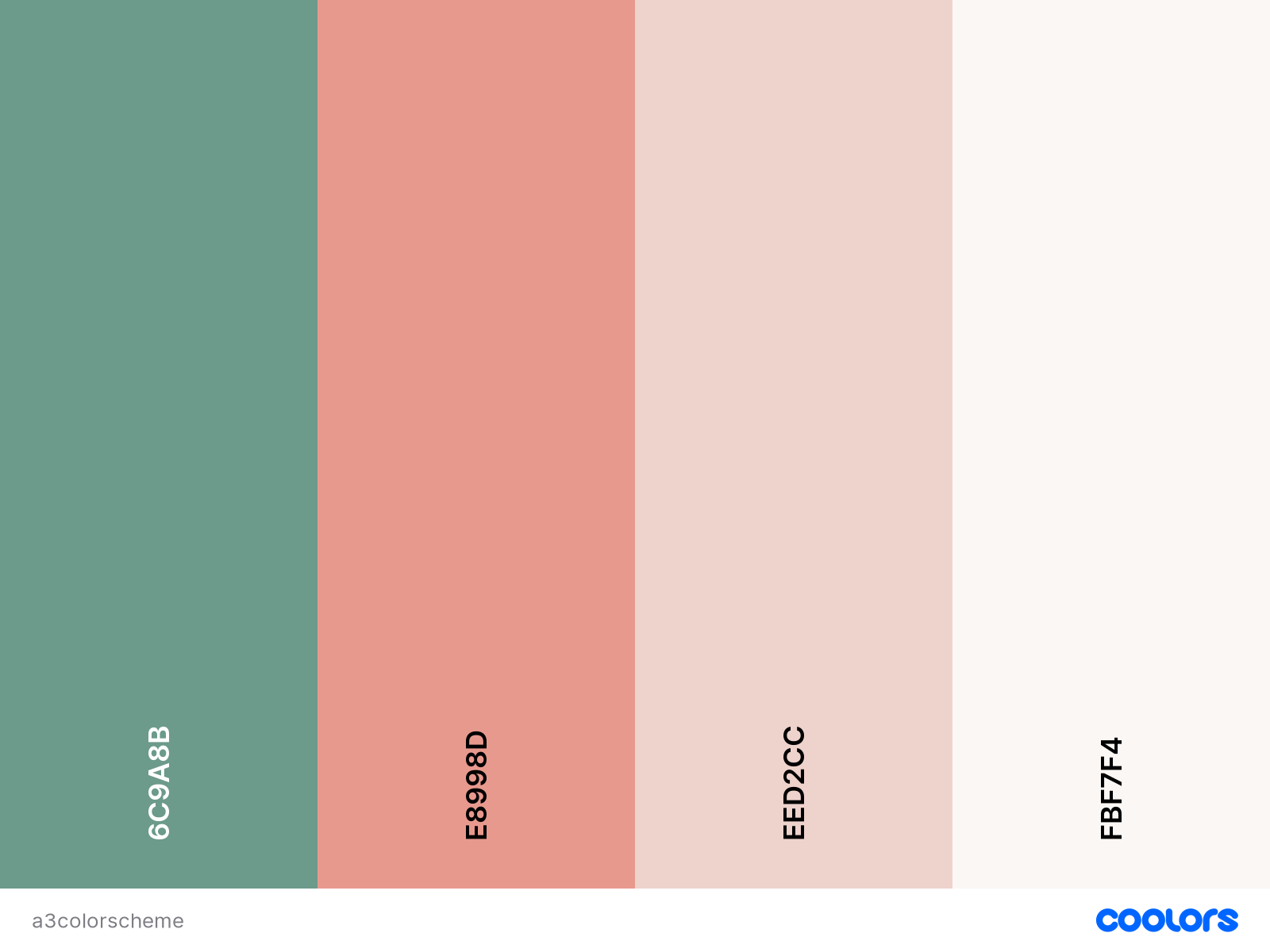
fast. I editted the spacing and color scheme of the elements I used to match the following colors:
I used 5 middleware express packages. The first package I used is the express static package which serves static files. I also used the body-parser express package which parses incoming JSON requests. I also used the urlencoded express package which parses incoming requests of strings or arrays. I used the cookie-session middleware to establish cookie based sessions. And finally I used a middleware package for the mongodb database connection.
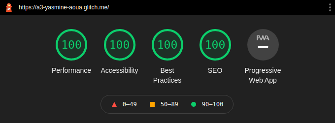
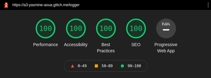
- Tech Achievement 1: I achieved 100% on all Lighthouse criteria on both my login page and chore logger page.
- Design Achievement 1: I followed the following tips from the W3C Web Accessibility Initiative...
Tip 1: Provide informative, unique page titles
I titled my pages CS4241 Assignment 3: Login Page and CS4241 Assignment 3: Chore Logger so that the user knows what the page is for.
Tip 2: Use headings to convey meaning and structure
I used h1 headers to designate the page titles and h2 headers to break up the instructions from the actual form.
Tip 3: Provide clear instructions
I gave written instructions on how to fill out the forms and any constraints on the data entered.
Tip 4: Provide sufficient contrast between foreground and background
I made sure that light background colors had dark text colors and vice versa.
I also made sure my buttons contrasted from the page color by making them a darker green since the page is a pale beige.
Tip 5: Ensure that interactive elements are easy to identify
I made my buttons switch color when you hover over it to let the user know that it is clickable.
Tip 6: Ensure that form elements include clearly associated labels
I wrote labels for all form elements that described what the input was for.
Tip 7: Provide easily identifiable feedback
I wrote alerts for failed login attempts or failed registration attempts as well as incomplete entry in the chore logger form.