50 UI Component plugins
Pixel Components
ZicBox load UI plugin, called component, and organize them by views. Those components have access to each others and to the audio plugins.

Show a representation of the ADSR envdelop.
<Adsr
  // If true, the rectangle will be outlined. Default is true.
  outline={false}
  // Set the color of the graph.
  fillColor="#ffffff"
  // If true, the rectangle will be filled. Default is true.
  filled={false}
  // Set the color of the graph outline.
  outlineColor="#000000"
  // Set the color of the background.
  bgColor="#000000"
  // If true, the title will be rendered on top of the graph. Default is true.
  renderValuesOnTop={false}
  // The audio plugin to get control on.
  plugin="audio_plugin_name"
  // The encoders that will interract with the ADSR envelop.
  encoders={[0, 1, 2, 3]}
  // The values that will interract with the ADSR envelop.
  values={["ATTACK", "DECAY", "SUSTAIN", "RELEASE"]}
/><Rect
// The background color.
bgColor="#000000"
// The color of the text
color="#ffffff"
// The font of the text. Default is null.
font="Sinclair_S"
// The font size of the text.
fontSize={8}
// The font of the text. Default is null.
smallFont="Sinclair_S"
// The font size of the text.
smallFontSize={8}
// The audio plugin to get serialized data.
serializerPlugin="audio_plugin_name"
sequencerPlugin="audio_plugin_name"
// The encoder id that will interract with this component.
encoderId={0}
/>Clips components to draw a rectangle.
<Clips
  // The background color of the text.
  bgColor="#000000"
  // The color of the text
  textColor="#ffffff"
  // Add extra index base on the current index and bank
  // The color of the text
  playColor="#ffffff"
  // The color of the text
  playNextColor="#ffffff"
  // The color of the text
  color="#ffffff"
  // The number of visible clips
  visibleCount={10}
  // Size of bank
  // Context id to trigger re-rendering if multiple instance of this component on the same view. (must be different to 0)
  // The sequencer audio plugin.
  sequencerPlugin="audio_plugin_name"
  // The audio plugin to get serialized data.
  serializerPlugin="audio_plugin_name"
  // The view to redirect once clip saved or selected.
  redirectView="view_name"
/>
Draw primitives on the view, like lines, ...
<Lines
  // The color of the rectangle.
  color="#000000"
  // The number of pixels to draw.
/>
Show a representation of a drum envelop (envelop with relative time and modulation, without sustain).
<DrumEnvelop
  // The audio plugin to get control on.
  audioPlugin="audio_plugin_name"
  // Envelop data id to get/set data in the audio plugin.
  envelopDataId="ENV_AMP"
  // Set if the envelop should be outlined or not. (default: true)
  outline={false}
  // Set if the envelop should be filled or not. (default: true)
  filled={false}
  // Set if the title should be rendered on top or not. (default: true)
  renderTitleOnTop={false}
  // Set the color of the graph.
  fillColor="#ffffff"
  // Set the color of the outline.
  outlineColor="#000000"
  // Set the color of the cursor.
  cursorColor="#ffffff"
  // Set the color of the text.
  textColor="#ffffff"
  // Set the id of the encoder to change time parameter.
  encoderTime={0}
  // Set the id of the encoder to change phase parameter.
  encoderPhase={0}
  // Set the id of the encoder to change modulation parameter.
  encoderModulation={0}
/>


Show FM algorithm and change them. The filled square are the carrier where audio is outputted and the not filled square are the operators modulating the frequency.
<FmAlgo
  // The background color of the text.
  bgColor="#000000"
  // The color of the text.
  textColor="#ffffff"
  // The color of the border.
  borderColor="#ffffff"
  // The encoder id that will interract with this component.
  encoderId={0}
  // The audio plugin to get control on.
  audioPlugin="audio_plugin_name"
  // The audio plugin key parameter to get control on.
  param="parameter_name"
  // The data id that will return the current algorithm layout.
  dataId="ALGO"
/>Displays the GitHub repository currently used in data/.
Github components to authenticate users.
<Rect
  // The background color.
  bgColor="#000000"
  // The text color.
  textColor="#000000"
  // The foreground color.
  foregroundColor="#000000"
  // The scroll color.
  scrollColor="#000000"
  // The active color.
  activeColor="#000000"
  // The font of the text. Default is null.
  font="Sinclair_S"
  // The font size of the text.
  fontSize={8}
  // The encoder id that will interract with this component.
  encoderId={0}
  // Set context id shared with other components to share the state.
  contextId={10}
  // Name of the default locale repo.
/>

Show a representation of data points and provide a way to control them.
<GraphEncoder
  // If true, the rectangle will be outlined. Default is true.
  outline={false}
  // Set the color of the graph.
  fillColor="#000000"
  // If true, the rectangle will be filled. Default is true.
  filled={false}
  // Set the color of the graph outline.
  outlineColor="#000000"
  // Set the color of the background.
  bgColor="#000000"
  // The audio plugin to get control on.
  plugin="audio_plugin_name"
  // The data id of the audio plugin where the input value will be sent.
  dataId="data_id"
  // The values that will interract with this component in order to watch them for refreshing the graph. */
  values={["LEVEL", "VOLUME"]}
  // If true, the data is an array. Default is false.
  isArrayData={false}
  // If true, the data is inverted. Default is false.
/><GraphEncoder
// The audio plugin to get control on.
audioPlugin="audio_plugin_name"
// The audio plugin key parameter to get control on.
param="parameter_name"
// If true, the data is inverted. Default is false.
/>HiddenContext
Hidden context component is used to change a context without to have a specific UI for it.
<HiddenValue
  // The encoder id that will interract with this component.
  encoderId={0}
  // Invert the encoder direction
  inverted={true}
  // Set min value
  min={0}
  // Set max value
  max={100}
  // Set step incrementation
  stepIncrementation={1.0}
  // Set context id
  contextId={0}
/>
HiddenValue
Hidden value component is used to change a value without to have a specific UI for it. By default it will update the group number. If a plugin parameter is set, it will update the value of this parameter.
<HiddenValue
  // The audio plugin to get control on.
  audioPlugin="audio_plugin_name"
  // The audio plugin key parameter to get control on.
  param="parameter_name"
  // The encoder id that will interract with this component.
  encoderId={0}
  // Invert the encoder direction
  inverted={true}
/>
Icon component is used to display icons.
<Icon
  // The icon to display.
  name="&icon::musicNote"
  // The background color of the text.
  bgColor="#000000"
  // The color of the text
  color="#ffffff"
/>
Keyboard components to display keyboard.
<Keyboard
  // The view to redirect once edit is finished.
  redirectView="view_name"
  // The audio plugin to send the input value.
  audioPlugin="audio_plugin_name"
  // The data id of the audio plugin where the input value will be sent.
  dataId="data_id"
  // Set the background color of the component.
  bgColor="#000000"
  // Set the color of the text.
  textColor="#ffffff"
  // Set the color of the item background.
  itemBackground="#ffffff"
  // Set context id shared to define the shift.
  shiftContextId={10}
  // The font
  font="PoppinsLight_8"
  // Keys labels
  keyLabels={["a", "b", "c", ...]}
  // Keys labels shifted
  keyLabelsShifted={["A", "B", "C", ...]}
/>
Keyboard components to display keyboard.
<Keyboard
  // The view to redirect once edit is finished.
  redirectView="view_name"
  // The audio plugin to send the input value.
  audioPlugin="audio_plugin_name"
  // The data id of the audio plugin where the input value will be sent.
  dataId="data_id"
  // Set the background color of the component.
  bgColor="#000000"
  // Set the color of the text.
  textColor="#ffffff"
  // Set the color of the selection.
  selectionColor="#ffffff"
  // Set the color of the item background.
  itemBackground="#ffffff"
/>
KnobValue is used to display current value of a parameter for a given audio plugin.
<KnobValue
  // The audio plugin to get control on.
  audioPlugin="audio_plugin_name"
  // The audio plugin key parameter to get control on.
  param="parameter_name"
  // The encoder id that will interract with this component.
  encoderId={0}
  // The type of the encoder. By default the component will define the type own his own. */
  type="TWO_SIDED" // when there is a centered value like PAN and you want to show both side value: 20%|80%
  type="TWO_VALUES" // when there is 2 possible values, for example one side is drive and the other side is compressor.
  type="NUMBER" // when the value is of type string but we still want to enforce to see his numeric value
  type="STRING"
  // Override the label of the parameter.
  label="custom_label"
  // Set the color of the knob.
  color="#3791a1"
  // Set the background color of the component.
  bgColor="#000000"
  // Set the color of the text.
  textColor="#ffffff"
  // Set how many digits after the decimal point (by default none.
  floatPrecision={2}
  // Hide the value of the parameter.
  hideValue={true}
  // Hide the unit of the parameter.
  hideUnit={true}
  // Hide middle circle background.
  hideCenterBackground={true}
  // Set the font size of the unit.
  unitSize={8}
  // Set the font size of the value.
  valueSize={8}
  // Set the font size of the title.
  titleSize={8}
  // Instead to show the value of the parameter in knob, show it under the knob. Can be useful for long string value.
  valueReplaceTitle={true}
  // Set inside radius of the knob.
  insideRadius={15}
/>
List components to display list of items.
<List
  // The list of items to add in the list.
  items={["item1", "item2", "item3"]}
  // The audio plugin to get control on.
  audioPlugin="audio_plugin_name"
  // Set the background color of the component.
  bgColor="#000000"
  // Set the color of the text.
  textColor="#ffffff"
  // Set the color of the selection.
  selectionColor="#ffffff"
  // Set the color of the item background.
  itemBackground="#ffffff"
/>
Show a representation of a macro envelop (envelop with relative time and modulation, without sustain).
<MacroEnvelop
  // The audio plugin to get control on.
  audioPlugin="audio_plugin_name"
  // Envelop data id to get/set data in the audio plugin.
  envelopDataId="ENV_AMP"
  // Set if the envelop should be outlined or not. (default: true)
  outline={false}
  // Set if the envelop should be filled or not. (default: true)
  filled={false}
  // Set the color of the graph.
  fillColor="#ffffff"
  // Set the color of the outline.
  outlineColor="#000000"
  // Set the color of the cursor.
  cursorColor="#000000"
  // Set the color of the text.
  textColor="#000000"
  // Set the color of the title.
  titleColor="#000000"
  // Set the id of the encoder to change the envelop prarameters.
  encoders={[0, 1, 2, 3]}
  // Set title to be displayed on bttom of the envelop.
  title="Macro Envelop"
/>Configurable rows × cols button matrix that maps to notes in a given scale and octave.
- Encoder 0: change scale
- Encoder 1: change octave
- Key press: noteOn
- Key release: noteOff
<Pattern
  // Sequencer audio plugin
  // Background color
  // Pattern (note) color
/><Rect
// The color of the rectangle.
color="#000000"
// The number of pixels to draw.
/>Play components show the playing state.
<Rect
  // The color of the rectangle.
  bgColor="#000000"
  // The color of the icon.
  color="#FFFFFF"
  // The color of the play icon.
  playColor="#00FF00"
  // The color of the record icon.
  recColor="#FF0000"
  // The mode of the component.
  mode="DEFAULT"
/>
audioPlugin="audio_plugin_name" scrollColor="#000000"

Rect components to draw a rectangle.
<Rect
  // The color of the rectangle.
  color="#000000"
  // If true, the rectangle will be filled. Default is true.
  filled={false}
/>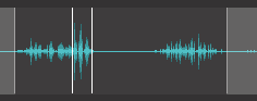
Sample is used to display an audio sample, sustain position, and start/end position. The little green dot are the current playing positions of the sample.
<Rect
  // The background color of the component
  bgColor="#000000"
  // The overlay color of the component
  overlayColor="#a2beb8"
  // The overlay edge color of the component
  overlayEdgeColor="#a2beb8"
  // The loop start color of the component
  loopStartColor="#548ebe"
  // The loop end color of the component
  loopEndColor="#548ebe"
  // The sample color of the component
  sampleColor="#548ebe"
  // Value keys
  valueKeys={{"browser": "BROWSER", "start": "START", "end": "END", "loopPosition": "LOOP_POSITION", "loopLength": "LOOP_LENGTH"}}
  // The audio plugin to get control on.
  audioPlugin="audio_plugin_name"
/>
audioPlugin="audio_plugin_name"

<SeqProgressBar
  // The audio plugin sequencer.
  audioPlugin="audio_plugin_name"
  volumePlugin={{ "plugin": "Volume", "param": "VOLUME" }}
  // The background color of the text.
  bgColor="#000000"
  // The foreground color of the text.
  fgColor="#ffffff"
  // The color of the active step.
  activeColor="#ffffff"
  // The color of the inactive step.
  inactiveStepColor="#ffffff"
  // The color of the selection.
  selectionColor="#ffffff"
  // Show sequencer step value.
  showSteps={true}
/>
<Sequencer
  // The audio plugin sequencer.
  // The data id to get steps from audio plugin sequencer.
  stepsDataId="STEPS"
  // The data id to get sequencer postion (current playing step) from audio plugin sequencer.
  seqPositionDataId="SEQ_POSITION"
  // The data id to get is playing state from audio plugin sequencer.
  isPlayingDataId="IS_PLAYING"
  // Data id to register playing sequencer event callback.
  // The data id to get steps count from audio plugin sequencer.
  stepCountDataId="STEP_COUNT"
  // The number of steps per row.
  stepPerRow={8}
  // The maximum number of steps.
  maxSteps={64}
  // The background color of the text.
  bgColor="#000000"
  // Color of the active step.
  activeStepColor="#000000"
  // Color of the step length.
  stepLengthColor="#000000"
  // Color of the step background.
  stepBackground="#000000"
  // Color of the inactive step.
  inactiveStepColor="#000000"
  // Color of the selected step.
  stepSelectedColor="#000000"
  // Color of the rows selection.
  rowsSelectionColor="#000000"
  // Set how many rows are selected, for example to show which rows are currently displayed on the keypad grid.
  rowsSelection={2}
  // Set context id shared between components to show selected step, must be different than 0.
  contextId={10}
  // The encoder id to scroll.
  encoderId={0}
/>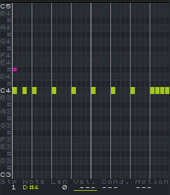
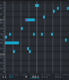
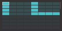
Sequencer components to draw the sequencer interface.
<Sequencer
  // The audio plugin sequencer.
  // The data id to get steps from audio plugin sequencer.
  stepsDataId="STEPS"
  // The number of piano notes to display on the screen.
  numNotes={24}
  // The background color of the text.
  bgColor="#000000"
  // The color of the black keys.
  blackKeyColor="#000000"
  // The color of the white keys.
  whiteKeyColor="#000000"
  // The color of the row separators.
  rowSeparatorColor="#000000"
  // The color of the beats.
  beatColor="#000000"
  // The color of the bars.
  barColor="#000000"
  // The color of the column separators.
  colSeparatorColor="#000000"
  // The color of the C notes and parameter values.
  textColor="#000000"
  // The color of the other notes and parameter labels.
  text2Color="#000000"
  // The color of the steps.
  stepColor="#000000"
  // The color of the selected step.
  selectedColor="#000000"
  // The color of the motion 1.
  textMotion1="#000000"
  // The color of the motion 2.
  textMotion2="#000000"
  // Parameter selection. 0 = Velocity, 1 = Condition, 2 = Motion, -1 = Deactivated
  parameterSelection={0}
  // Max step length
  maxStepLen={1}
/>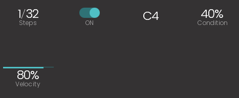
<Sequencer
  // The audio plugin sequencer.
  // The data id to get steps from audio plugin sequencer.
  stepsDataId="STEPS"
  // The data id to get steps count from audio plugin sequencer.
  stepCountDataId="STEP_COUNT"
  // The maximum number of steps.
  maxSteps={64}
  // The background color of the text.
  bgColor="#000000"
  // The color of the text.
  labelColor="#FFFFFF"
  // The color of the value.
  valueColor="#FFFFFF"
  // Set the color of the bar.
  barColor="#FF0000"
  // Set context id shared between components to show selected step, must be different than 0.
  contextId={10}
  // The font of the value. Default is null.
  fontValue="PoppinsLight_8"
  // The font of the label. Default is null.
  fontLabel="PoppinsLight_8"
  // The encoder id that will interract with this component.
  encoderId={0}
  // Type: "STEP_SELECTION", "STEP_TOGGLE", "STEP_NOTE", "STEP_VELOCITY", "STEP_CONDITION", "STEP_LENGTH"
  // Select step using as well the length, meaning the step will be selected not only from his starting position but also any following steps covered by his length.
/>
StepEditSample component is used to edit a step value for samples.
<StepEditSample
  // The audio plugin to get control on.
  // Index of the step.
  stepIndex={0}
  // The background color of the text.
  bgColor="#000000"
  // The color of the text
  textColor="#ffffff"
  // The color of the actual playing step.
  playingColor="#ffffff"
  // The color of the selected step.
  selectedColor="#ffffff"
/>
audioPlugin="audio_plugin_name" param="parameter_name" fontLabel="PoppinsLight_8" labelSize={6} bgColor="#000000" labelColor="#FF0000"
Multi lines text.
<Text
  // The text to display.
  text="Hello World"
  // The font of the text. Default is null.
  font="Sinclair_S"
  // The font size of the text.
  fontSize={8}
  // The font height of the text. Default is 0.
  fontHeight={0}
  // The background color of the text.
  bgColor="#000000"
  // The color of the text
  color="#ffffff"
  // The color of the text
  color2="#ffffff"
/>
Text component is used to display text.
<Text
  // The text to display.
  text="Hello World"
  // If true, the text will be centered. Default is false.
  centered={true}
  // If true, the text will be right aligned. Default is false.
  right={true}
  // The font of the text. Default is null.
  font="Sinclair_S"
  // The font size of the text.
  fontSize={8}
  // The font height of the text. Default is 0.
  fontHeight={0}
  // The background color of the text.
  bgColor="#000000"
  // The color of the text
  color="#ffffff"
/>
// The sequencer audio plugin. // The engine audio plugin. // The timeline audio plugin. // Encoder to scroll left/right // Encoder to move clip fontLane="PoppinsLight_8" // Set context id shared between components to show selected track, must be different than 0. trackContextId={10} // Set context id shared between components to show selected step, must be different than 0. stepContextId={11} // Default selected track // Set context id shared between components to show selected step, must be different than 0. // Set the min track number // Set the max track number
<Rect
  // The background color.
  bgColor="#000000"
  // The color of the text
  color="#ffffff"
  // The font size of the text.
  iconSize={8}
  // Sequencer plugin
  sequencerPlugin="audio_plugin_name"
/>

Value component is used to display an audio plugin parameter value.
<KnobValue
  // The audio plugin to get control on.
  audioPlugin="audio_plugin_name"
  // The audio plugin key parameter to get control on.
  param="parameter_name"
  // The encoder id that will interract with this component.
  encoderId={0}
  // Override the label of the parameter.
  label="custom_label"
  // Use the number value instead of string value (default: false).
  useNumberValue={true}
  // Set the bar height (default: 2).
  barHeight={2}
  // Set the bar background height (default: 1).
  barBgHeight={1}
  // Set the text vertical alignment to center (default: false).
  verticalAlignCenter={true}
  // Set the text horizontal alignment to left (default: false).
  alignLeft={true}
  // Hide the label (default: false).
  hideLabel={true}
  // Hide the unit (default: false).
  hideUnit={true}
  // Hide the value (default: false).
  hideValue={true}
  // Shows the label over the value, 4 px from the top of the component (default: -1) `
  showLabelOverValue={4}
  // Set the distance from the left of the component where the label will be placed. If -1 it is centered (default: -1)
  labelOverValueX={0}
  // The font of the value. Default is null.
  fontValue="PoppinsLight_8"
  // The font of the label. Default is null.
  fontLabel="PoppinsLight_8"
  // Set the font size of the value (default: 8).
  valueSize={8}
  // Set the font size of the label (default: 6).
  labelSize={6}
  // Set the font size of the unit (default: 6).
  unitSize={6}
  // The font height of the text. Default is 0.
  valueHeight={16}
  // Set the background color of the component.
  bgColor="#000000"
  // Set the color of the label.
  valueColor="#FF0000"
  // Set the color of the bar.
  barColor="#FF0000"
  // Set the color of the unit.
  unitColor="#FF0000"
  // Set the color of the label.
  labelColor="#FF0000"
/>A knob to switch between workspaces
<Text
  // The font size of the text.
  fontSize={8}
  // The font of the text. Default is null.
  font="Sinclair_S"
  // The font size of the text.
  labelFontSize={8}
  // The font of the text. Default is null.
  labelFont="Sinclair_S"
  // The background color of the text.
  bgColor="#000000"
  // The color of the text
  color="#ffffff"
  // The color of the text
  labelColor="#ffffff"
  // Color the active workspace badge.
  badgeColor="#23a123"
  // The encoder id that will interract with this component.
  encoderId={0}
  // The audio plugin to get control on.
  audioPlugin="audio_plugin_name"
  currentWorkspaceDataId="CURRENT_WORKSPACE"
/>
Workspaces components show the list of available workspaces.
<Workspaces
  // The audio plugin to load serialized data.
  audioPlugin="audio_plugin_name"
  currentWorkspaceDataId="CURRENT_WORKSPACE"
  refreshStateDataId="CREATE_WORKSPACE"
  // The background color of the text.
  bgColor="#000000"
  // Color the active workspace badge.
  badgeColor="#23a123"
  // Color of the error message.
  errorColor="#ab6363"
/>