Using R to find any insightful pattern from the tracker data
This is a Google Analytics Certificate Project. Data used in this project was retrieved from Kaggle.There are two main goals for this analysis: 1. Find any trends among the data 2. The usage of the trend.
# Set the D drive as working directory
setwd("D:/GoogleDataAnalytics/CaseStudy_BellaBeat/FitabaseData")
#install.packages("tidyverse")
#install.packages('reshape2')
library(readr)
library(dplyr)
library(lubridate)
library(reshape2) #organize correlation heat map matrix
library(ggplot2)
DailyAct <- read_csv('dailyActivity_merged.csv')      # Use
# DailyCalo <- read_csv('dailyCalories_merged.csv')     # No
# DailyInten <- read_csv('dailyIntensities_merged.csv') # No
# DailyStep <- read_csv('dailySteps_merged.csv')        # No
#HeartRateS <- read_csv('heartrate_seconds_merged.csv')# Keep
HourCalo <- read_csv('hourlyCalories_merged.csv')     # No
#HourInten <- read_csv('hourlyIntensities_merged.csv') # Keep
HourStep <- read_csv('hourlySteps_merged.csv')        # No
#MinMet <- read_csv('minuteMETsNarrow_merged.csv')     # Keep
#MinSleep <- read_csv('minuteSleep_merged.csv')        # Keep
SleepDay <- read_csv('sleepDay_merged.csv')           # Use
WeightLog<- read_csv('weightLogInfo_merged.csv')      # Use
summary(DailyAct)
DailyCalo, DailyInten and DailyStep are included in DailyAct, thus they will not be used in further analysis.
HourStep, HourCalo will be used for validation with DailyAct.
#summary(DailyCalo)
#summary(DailyInten)
#summary(DailyStep)
#summary(HeartRateS)
summary(HourCalo)
#summary(HourInten)
#summary(MinMet) # Not sure what METs is
#summary(MinSleep) # Not sure what value and logid mean
summary(SleepDay) # *Analysis*: TotalSleepRecords and TotalMinutesAsleep TotalTimeInBed
summary(WeightLog)
Validate data with DailyAct
Sum of Daily Steps in HourStep is not exactly identical to DailyAct but they did not differentiate too much. Sum of Daily Calories in HourCalo is not exactly identical to DailyAct but they did not differentiate too much.
str(HourCalo)
HourCalo$ActivityHour <- as.Date(HourCalo$ActivityHour, format = "%m/%d/%Y")
HourCalo %>%
  group_by(Id, ActivityHour) %>%
  summarise(sum(Calories))
str(HourStep)
HourStep$ActivityHour <- as.Date(HourStep$ActivityHour, format =  "%m/%d/%Y")
HourStep %>%
  group_by(Id, ActivityHour) %>%
  summarise(sum(StepTotal))
- change data type
- imputation
- plot to find pattern
TotalDistance and TrackerDistance are basically identical.
str(DailyAct)
DailyAct$Id <- as.factor(DailyAct$Id)
DailyAct$ActivityDate <- as.Date(DailyAct$ActivityDate, format = "%m/%d/%Y")
str(DailyAct)
head(DailyAct)
summary(DailyAct)
unique(DailyAct$Id) # 33 unique ID
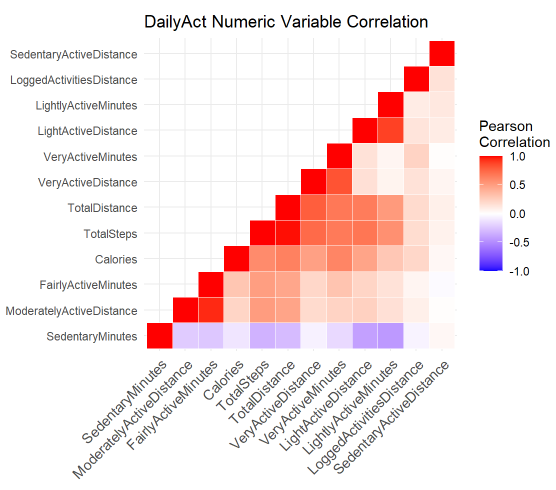
build a DailyAct numeric variable correlation map
DailyAct.num <- DailyAct %>%
  select(-c(Id,ActivityDate,TrackerDistance))
cormat <- round(cor(DailyAct.num),2)
head(cormat)
# get upper triangle of the correlation matrix
  get_upper_tri<-function(cormat){
    cormat[lower.tri(cormat)] <- NA
    return(cormat)
  }
# reorder the correlation matrix
reorder_cormat <- function(cormat){
# Use correlation between variables as distance
dd <- as.dist((1-cormat)/2)
hc <- hclust(dd)
cormat <-cormat[hc$order, hc$order]
}
# Reorder the correlation matrix
cormat <- reorder_cormat(cormat)
upper_tri <- get_upper_tri(cormat)
# Melt the correlation matrix
cormat_melt <- melt(upper_tri, na.rm = TRUE)
# Create a ggheatmap
ggheatmap <- ggplot(cormat_melt, aes(Var2, Var1, fill = value))+
 geom_tile(color = "white")+
 scale_fill_gradient2(low = "blue", high = "red", mid = "white",
   midpoint = 0, limit = c(-1,1), space = "Lab",
    name="Pearson\nCorrelation") +
  theme_minimal()+ # minimal theme
 theme(
   axis.title.x = element_blank(),
   axis.title.y = element_blank(),
   axis.text.x = element_text(angle = 45, vjust = 1,
                              size = 10.5, hjust = 1)) +
  coord_fixed() +
  labs(title = 'DailyAct Numeric Variable Correlation')
print(ggheatmap)
-
Negative relationship happened between SedentaryMinutes, LightActiveDistance (-0.41) and LightlyActiveMinutes(-0.44)
-
Positive relationship(0.95) happened betweenModeratelyActiveDistance and FairlyActiveMinutes
-
slightly positive relationship(0.04) between SedentaryActiveDistance and SedentaryMinutes, which is normal
-
positive relationship(0.89) shared between LightActiveDistance and LightlyActiveMinutes
-
positive relationship(0.83) shared between VeryActiveDistance and VeryActiveMinutes
str(SleepDay)
SleepDay <- SleepDay %>%
  rename(SleepDatetime = SleepDay)
SleepDay$Id <- as.factor(SleepDay$Id)
# separate the date the time as the time are all the same, omit SleepDatetime column
SleepDay$SleepDate <- substr(SleepDay$SleepDatetime, 1, 9)
SleepDay$SleepDate <- as.Date(SleepDay$SleepDate, format = "%m/%d/%Y") #time only starts from 12AM
SleepDay$Weekday <- wday(SleepDay$SleepDate, label = TRUE, week_start = 1)
str(SleepDay)
head(SleepDay)
summary(SleepDay)
unique(SleepDay$Id) # 24 unique Id
Use bar chart to find the trend for TotalMinutesAsleep, TotalTimeInBed and SleepDate
Slplt_Date <- SleepDay %>%
  select(TotalMinutesAsleep, TotalTimeInBed, SleepDate) %>%
  group_by(SleepDate) %>%
  summarise(TotalMinutesAsleep = mean(TotalMinutesAsleep), TotalTimeInBed = mean(TotalTimeInBed))
Slplt_Date02 <- melt(Slplt_Date, id.vars = 'SleepDate')
plt <- ggplot(Slplt_Date02, aes(x = SleepDate, y = value, fill = variable)) +
  geom_bar(stat = 'identity', position = 'dodge') +
  scale_x_date(breaks = Slplt_Date02$SleepDate) +
  theme(axis.text.x = element_text(angle = 90, size = 10)) +
  labs(y = 'Total Minutes', title = 'Time In Bed and Time Asleep Everyday')
plt
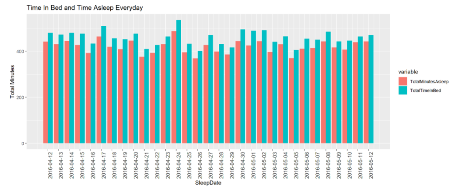
Limited info is found in this bar chart, thus below are zoomed in line chart between TotalMinutesAsleep, TotalTimeInBed and SleepDate. The line chart below can tell better difference between TotalMinutesAsleep, TotalTimeInBed and SleepDate.
plt <- ggplot(data = Slplt_Date, aes(x = SleepDate)) +
  geom_line(aes(y = TotalMinutesAsleep), color = 'orange') +
  geom_line(aes(y = TotalTimeInBed), color = 'dark green') +
  labs(y = 'Total Minutes', title = "Time In Bed and Time Asleep Everyday") +
  scale_x_date(breaks = Slplt_Date02$SleepDate) +
  theme(axis.text.x = element_text(angle = 90, size = 8)) +
  geom_hline(yintercept = 397.8, color = 'pink') +
  geom_hline(yintercept = 478.2, color = 'pink') +
  annotate("text", x= as.Date('2016-04-16'), y=390, label = "Sat",
           color ='red', size=3) +
  annotate("text", x= as.Date('2016-04-21'), y=374.5, label = "Thu",
           color ='black', size=3) +
  annotate("text", x= as.Date('2016-04-26'), y=368, label = "Tue",
           color ='black', size=3) +
  annotate("text", x= as.Date('2016-04-29'), y=384.5, label = "Fri",
           color ='black', size=3) +
  annotate("text", x= as.Date('2016-05-03'), y=395.5, label = "Tue",
           color ='black', size=3) +
  annotate("text", x= as.Date('2016-05-05'), y=368.5, label = "Thu",
           color ='black', size=3) +
  annotate("text", x= as.Date('2016-04-12'), y=483, label = "Tue",
           color ='black', size=3) +
  annotate("text", x= as.Date('2016-04-14'), y=483.5, label = "Thu",
           color ='black', size=3) +
  annotate("text", x= as.Date('2016-04-17'), y=511, label = "Sat",
           color ='black', size=3) +
  annotate("text", x= as.Date('2016-04-24'), y=538, label = "Sun",
           color ='black', size=3) +
  annotate("text", x= as.Date('2016-04-24'), y=489, label = "Sun",
           color ='red', size=3) +
  annotate("text", x= as.Date('2016-04-30'), y=498, label = "Sat",
           color ='red', size=3) +
  annotate("text", x= as.Date('2016-05-01'), y=488, label = "Sun",
           color ='red', size=3) +
  annotate("text", x= as.Date('2016-05-02'), y=495, label = "Mon",
           color ='red', size=3) +
  annotate("text", x= as.Date('2016-05-08'), y=488, label = "Sun",
           color ='black', size=3)
plt
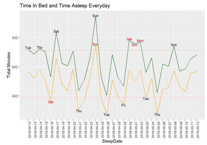
The pink lines shown in the line chart above are the 25% quantile of TotalTimeInBed and 75% quantile of TotalTimeAsleep.
-
Among those test people, they spent the most time in bed and also the most time asleep on Sunday, April, 24th, 2020
-
Three days in a row on the weekend from April, 30th to May, 2nd, 2020, people spent time in bed a lot, however, asleep less. I am assuming it is a holiday weekend but further analysis are required due to lack of the location of the people
-
I assumed less asleep time will happen on weekdays, however, on Sat, April, 16th, 2020, people had TotalAsleepTime less than the 25% average
The chart for days in the week were plotted below for deeper analysis.
Slplt_Weekday <- SleepDay %>%
  select(TotalMinutesAsleep, TotalTimeInBed, Weekday) %>%
  group_by(Weekday) %>%
  summarise(TotalMinutesAsleep = mean(TotalMinutesAsleep), TotalTimeInBed = mean(TotalTimeInBed))
Slplt_Weekday02 <- melt(Slplt_Weekday, id.vars = 'Weekday')
plt <- ggplot(data = Slplt_Weekday02, aes(x = Weekday, y = value, fill = variable)) +
  geom_bar(stat = 'identity', position = 'dodge') +
  labs(x = "Day Of Week", y = 'Total Minutes', title = "Time In Bed and Time Asleep In Day of Week")
plt
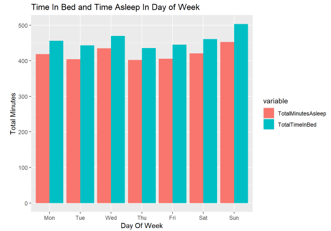
I thought people will spend more time in bed and sleep more on the weekends, however, our data show a different story. They tend to sleep the most on Sunday and Wednesday. This raises my curiosity in what kind of occupation the 24 people are.
str(WeightLog)
WeightLog$Id <- as.factor(WeightLog$Id)
WeightLog$RecordDate <- substr(WeightLog$Date, 1, 9)
WeightLog$RecordDate <- as.Date(WeightLog$RecordDate, format = '%m/%d/%Y')
WeightLog$Date <- mdy_hms(WeightLog$Date, tz=Sys.timezone())
str(WeightLog)
summary(WeightLog) #65/67 NA in Fat so will not be used for further analysis
WeightLog <- WeightLog %>%
  select(-Fat)
unique(WeightLog$Id) # 8 unique Id
df <- WeightLog %>%
  select(RecordDate, WeightPounds, BMI) %>%
  group_by(RecordDate) %>%
  summarise(AVGWeight = mean(WeightPounds), AVGBMI = mean(BMI))
plt <- ggplot(data = df, aes(x= RecordDate)) +
  geom_line(aes(y = AVGWeight), color = 'purple') +
  geom_line(aes(y = AVGBMI), color = 'blue') +
  labs(y = 'BMI & Pounds') +
  scale_x_date(breaks = df$RecordDate) +
  theme(axis.text.x = element_text(angle = 90, size = 8)) +
  geom_point(aes(x = as.Date('2016-04-13'), y = 206.1322), color = 'red') +
  geom_point(aes(x = as.Date('2016-04-13'), y = 32.39667), color = 'red') +
  geom_point(aes(x = as.Date('2016-04-26'), y = 187.6134), color = 'red') +
  labs(title = 'Average Weight(LB) and BMI Trend')
plt
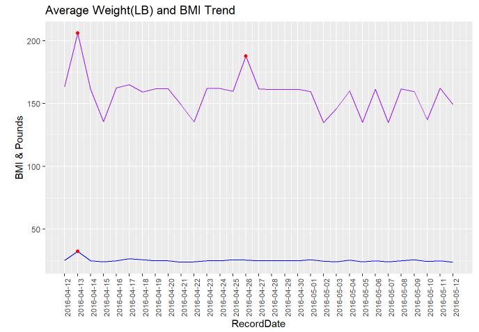
Based on the line chart above, there are three data points marked in red on April, 13th and April, 26th, which are abnormal and extremely high. Further analysis will be conducted.
Below, I will drill deeper to see the potential reason for both WeightPounds and BMI being high on April, 13th and WeightPounds High but BMI normal on April, 26th.
Weight_df <- WeightLog %>%
  select(Id, RecordDate, WeightPounds, BMI) %>%
  group_by(Id) %>%
  count(Id) %>%
  arrange(Id)
Weight_df
df <- WeightLog %>%
  select(Id, RecordDate, WeightPounds, BMI) %>%
  filter(RecordDate == '2016-04-13'| RecordDate == '2016-04-26')
df
According to two of the zoomed in data, which the first one grouped and counted by the Id ; the second one filtered on only the two days we cared about(4/13 & 4/26), I am guessing two facts:
-
Id 1927972279 has obesity and Id 1927972279 has only one record, which led to both WeightPounds and BMI raise on April 13th
-
Id 8877689391 is tall, which caused only the WeightPounds raised. Besides, April 26th has only one record, which is Id 8877689391. That explained although Id 8877689391 has total 24 records in the WeightLog data, only April 26th was affected.
- The above assumptions are based on the information I have, and further validation would need more data such as height.
FitBit Fitness Tracker Data. Kaggle. https://www.kaggle.com/arashnic/fitbit.
ggplot2 : Quick correlation matrix heatmap - R software and data visualization. STHDA. http://www.sthda.com/english/wiki/ggplot2-quick-correlation-matrix-heatmap-r-software-and-data-visualization