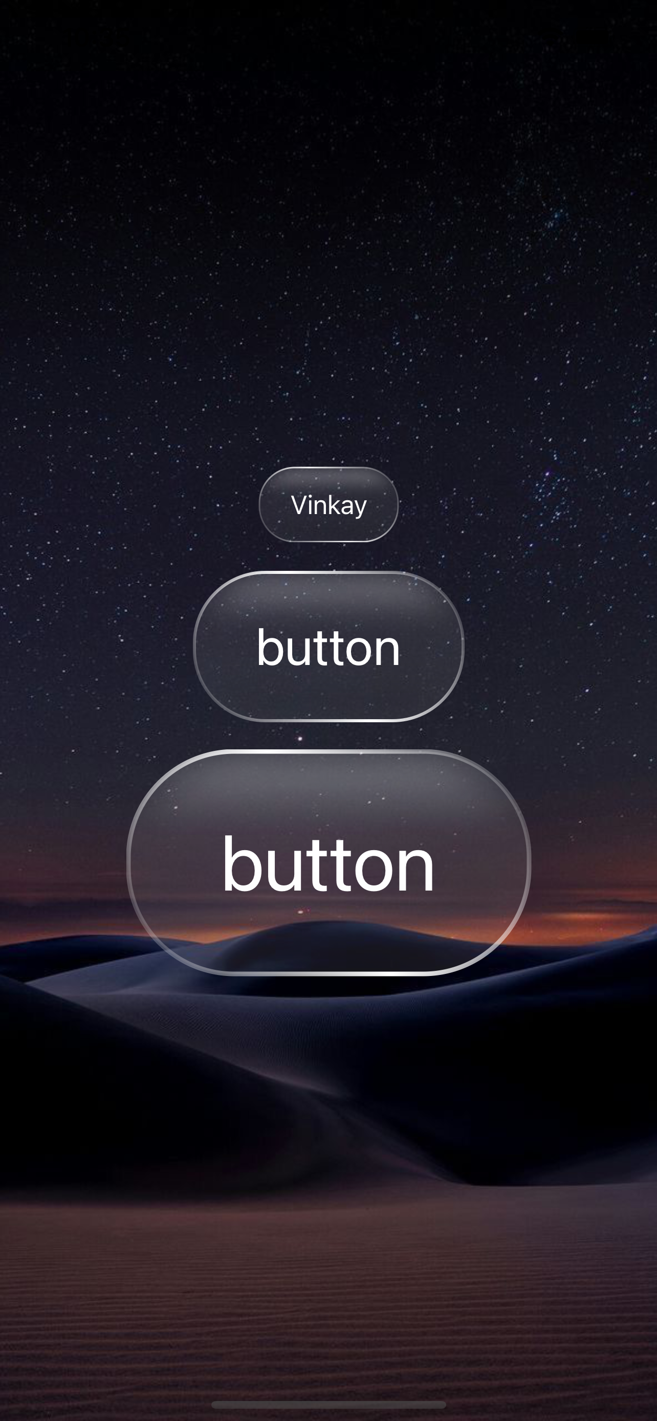
A beautiful glass morphism button component designed for iOS with SwiftUI. This button creates a transparent, blurred effect with subtle inner shadows, delivering a modern and elegant user experience.
- Glass Morphism Effect: Frosted glass effect with blur background
- Inner Shadow: Inner shadow creating depth and dimension
- Gradient Stroke: Border with 45-degree linear gradient
- Scalable: Flexible size adjustment
- Customizable: Easy to customize colors, sizes and styles
- iOS 15.0+
- Xcode 14.0+
- Swift 5.7+
Main button component with properties:
title: String- Text displayed on the buttonscale: CGFloat- Scale factor for size (default: 1.0)
Custom blur view using UIVisualEffectView:
style: UIBlurEffect.Style- Blur effect styleintensity: CGFloat- Blur intensity
Custom inner shadow view creating inner shadow:
color: Color- Shadow colorradius: CGFloat- Shadow blur radiusx: CGFloat- X-axis offsety: CGFloat- Y-axis offsetcornerRadius: CGFloat- Corner radiusspread: CGFloat- Shadow spread (default: 0.5)
The button is designed with the following characteristics:
- Background: Transparent with blur effect (
systemUltraThinMaterial) - Padding: Horizontal 20, Vertical 14 (scalable)
- Corner Radius: 23 (scalable)
- Inner Shadow Top:
- Position: x: 0, y: 2
- Blur: 4
- Color: White 40%
- Inner Shadow Bottom:
- Position: x: 0, y: -2
- Blur: 4
- Color: Black 25%
- Stroke: 45-degree linear gradient with white opacity from 5% → 100% → 5%
- Text Color: White
See ContentView.swift file for a complete usage example with 3 buttons of different sizes.
Nguyễn Quốc Vinh (Github: Vinkay215)
The Unlicense
This project is created for educational purposes and free use. Code is released into the public domain, you can use, modify and distribute without any restrictions.